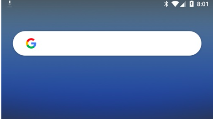
There is a list of designs for the search bar that will appear on Android smartphones when you access Google. The fact is, only one of those can be implemented, and Google needs to make their choice. With that being said, 9to5Google has observed recently that the company is using the Google App beta for Android to see what some users think of the designs.
What do the new Google search bars look like?
The publishers offered some explanations afterward saying that the three iterations are not that different from one another. One of the iterations shows the wake-up phrase say “Hey Google” as well as a magnifying tool icon, the second one has an “Ask any question” prompt in it, while the third possible design for the search bar does not have any words and keeps the icon.
At the moment, the search box is still shaped like a pill in all three of the iterations being outlined in a shade of grey that complements the white in the background. In addition to that, 9to5Google mentioned that in both the web and desktop Chrome’s New Tab page, you could see the magnifying tool icon popping up.
More details into the matter
What is even more interesting is that another variant could inherit the desktop’s version blinking cursor in the search field which might not look that nice. Aside from the design, Google also decided to make our searches easier and show the most recent ones underneath the search bar.
You need to keep in mind that even though you have the latest Google App beta, you might not get to see the changes because they can’t be seen by everyone. Google has only chosen a particular number of testers that could vote on these designs.
